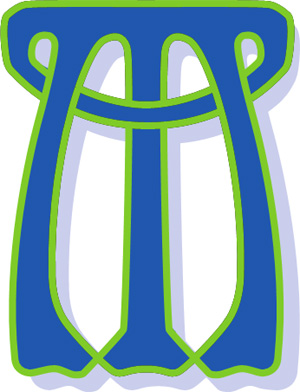
History of the big 'M'
Designed by Alistair MacDonald (Born in 1934).
The designer Alistair MacDonald came to Breaks after leaving Fine Fare, a UK wide supermarket chain where he had been the senior Publicity and Advertising Manager.
A painter and calligrapher, Alistair was born in Tighnabruaich, Argyll. He attended Woolwich Polytechnic School of Art where he studied under Heber Mathews and Joan Dawson. He was a member of the Royal Institute of Miniature artists, specialising in country scenes.
He came to Breaks Manor in the early 90’s to run art classes, teaching all forms of art.
So, how does the ‘big M’ relate to Breaks Manor?
If you look closely, there is the obvious M for Manor. There is a B at the top (at 90 degrees). Then there are two further ‘B’s’ on the vertical supporting stalks. The centre stem is the letter Y for Youth, with the ‘cup’ cutting across the top of the Y is C for Centre.
We remain very grateful to Mac, as he was known, for his gift to Breaks Manor. The iconic logo continues to evolve over time, as does Breaks Manor Youth and Community Centre.

